Thursday 7 February 2013

Harry Potter book research.

Harry Potter Book Research.


 This is the cover for the majority of the books around the world, and i think it has a very childish, cartoon style to it, but i do like how it shows an important part of the book, the train which takes them to Hogwarts, and the main character, Harry, on the front, but i just don't like the style as it's not that eye catching.


 This is another cover, which isn't very popular and rarely seen yet still invokes an important part of the story which is a key part of this book, but to understand it you'd have to read it otherwise it could look a bit strange, but again like the one above, i think this has been aimed more towards the younger generation with a cartoon style.


This is mainly seen in America, as it says Sorcerers instead of Philosophers but other than that small fact, i like how in this, it shows a game that is used through out the book, and at times, is the setting for some important scenes  and i really like how they've linked that with the main cover, but the only thing that i personally don't like about it is that it's like the ones above and aimed more at the younger generation.


This final one is much better in my opinion as it works well with the story line and is much more effective on a whole. I like how the red stone, which is the philosophers stone, stands out really well, and is eye catching as its the only real detailed object on the cover. For me this looks more aimed towards teenagers up to adults and more for the older generation as its not been animated and not in a cartoon style.


Over all i find that the majority of the books were aimed at the younger generation but i much prefer the last one as it was aimed more towards my own ages group and it looks more interesting on a whole.


________________________________________________________________________

Mind map Harry Potter.


This is one of my mind maps for getting ideas for my Harry Potter book cover. I thought of the main things with in the first book and am going to develop a couple of them into ideas to generate more ideas from that and then get more inspiration for a book cover.

Copy & Cutting Options in Photoshop cs6


This shows 4 selection tools that help copying/cutting on photoshop, all are good tools to use but for basic shapes only, anything with a few bends in it would  be difficult for this tool.

The Lasso tool are much more useful and better than the marquee tools, as these can easily go round bends and do lots of shapes, i really like the Magnetic Lasso Tool, as it automatically knows where the shape is what your selection and all you have to do is move the mouse near the line and it selects it for you. the only bad part is that it can take a bit of getting used too, and requires a lot of patience and time.

The Magic wand and quick selection are very useful tools again and really basic and easy to use, the only downside for me is sometimes it just doesn't get everything you want when you select it, which you can use then go to Select, and Similar and that selects all the colours that are near the same shade as what your trying to select so it can save a lot of time, but still doesn't get all of it.

Pen tool is one of my favourites to use, as it is really accurate but it is possibly the most difficult to actually get used to and requires a lot of time just learning how to use it but overall it has to be the best cutting out tool on photoshop. for shapes and objects.

For cutting out hair and very delicate objects i would use either Refine edge, found in the Select tap, or i would use the select similar after clicking once with magic wand tool, as they are the easiest and best options for hair and small messy objects like that.


_________________________________________________________________________________

Water Effect on Photoshop


In this i will be showing you how i Created a Running Water effect In Photoshop CS6


Create a new document, i did mine 10cm by 10 cm, with 300 resolution.

Once you've pressed OK and created your new document, create a new layer by clicking onto the icon next to the trash can at the bottom, and have the new layer selected.

Go to the colour panel and get a grey colour then press ok.
Click Edit, then Fill, and then press okay and it should make your new layer the grey colour you just chose.
Then to add a Fibers go to Filter, Render then Fibers and a small screen should appear.


This is the screen that should appear, one this change the Variance to 20, and the strength to 5, your pattern may be slightly different but should still work fine.

Then once you've clicked OK, we need to add a blur on to it, go to Filter, Blur, and then down to Gaussian Blur, and a small screen should open up again.

On the just change the Radius to 6 pixels, and it should go more blurry, if you have the Preview button ticked. Once you've done that press Ok.
Then were going to add another blur, but this times its going to be a Motion Blur, its in the same place as the Gaussian Blur, so Filter, Blur, then Motion Blur, and again, a small menu you should appear.
For this, Change it to 90 degree angle, and 100 pixels in distance then press OK.


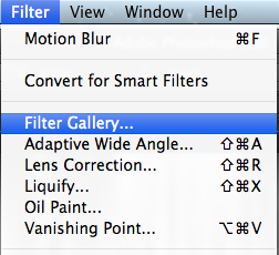
Now were going to add a Plastic Wrap effect, on some photoshops, its in Filter, Artistic, then Plastic Wrap, but on mine (cs6) its Filter, Filter Gallery then a menu appears.


When that menu appears Click on Artistic, usually the top one, and look for Plastic Wrap, Change 
the Highlight Strength to 15
the Detail to 10
and the Smoothness to 10
once you've done that press OK

After the steps so far, mines now looking like this, hopefully anyone following this, yours will look the same.

Open up Filter Gallery again, Filter, Filter Gallery.


Once open go to Sketch, and Chrome, put the Detail to 0 and the smoothness to 8 then press OK.


Once thats been done i went to Edit, Transform, and Warp a Grid then appeared over my layer, I made it really narrow and just messed around with it loads, put a few twists in it until i got something i was happy with.

Thats what i was left with after a few minutes of warping it, which still doesn't look much like water.


Create a new layer then go to the Gradient tool and create one.
Create a Gradient with Dark blue and the start and finish, and a lighter shade in the middle, Hold shift and drag it across the centre of the image to get a decent gradient  of blue and then once thats done click back on to the layer with the "water" on it.


Move the "water" above the gradient layer.

And Change it from Normal to Hard Light.

If the "water" is too faint and can't really make it out just select the layer, and go to Layer, Duplicate Layer, and it should work more effect.


Finished Water effect.

Research

Research

Other Photographer Research

In this post i shall be annotating a few other peoples blogs, pointing out what i think is good and bad, doing this i hope to be able to  pick up a few tips, and try make this blog slightly better.

The first blog i looked at was by Lawson Photography, which i really like the layout, it's nice and simple, the search system to try find your photos is also really easy to use, over all i think it is a really good blog, the only downside personally for me is the colour scheme, at first glance it doesn't look that appealing, possibly something a little bit brighter, as it looks really neutral and plain at the moment.

The next blog i looked at was by Chase Jarvis. I think it offers lots of information but it just looks a bit confusing compared to the Lawson Photography everything seems to be squeezed into one place, at one point on the screen theres around 14 different things to actually clicked on and its a bit of an information overload, but then due to the amount of information on the page, i think having a plain colour really does well, as if it was a bright colour it would be too over powering. 

The last one am looking at today is by Philip Bloom. This is possibly the best one out of the three in my opinion, it may not be as easy as Lawson, it may not be as plain as Jarvis, but it has its own unique style i like how everything is just in a single column which is a lot easier to read the Jarvis blog, and i really like the back ground image as well, i think that just stands out a lot from the other two, if i had to pick something that i didn't like about this blog it would be the 1-17 top posts, i would have had a 1-10 or even 1-5 as it seems a lot better, and less random.

Making a Gif

Making a Gif 


First get the image with several frames and put it onto photoshop.
    Using a selection tool, make a selection of the first frame, 
press file, and new, and paste it into the new document.

select each frame from the first image
and copy and paste them into the new
document one by one


 Once done click window,
timeline and be sure to click
on the icon above, which will
be at the bottom of the page.


click the new layer icon on the time line, and make sure
that only the first layer is visible.


Create another new layer on the timeline, and make sure
you've clicked on it, and make just the second layer visible.

Do the same for the third and for the rest of the frames, and
make the speed to "no delay" and press play.


should be the final outcome.

Statement Of Intent


My statement of intent, 


For this work I am going to try design and make a new book jacket for Harry Potter and the philosophers/ sorcerers stone, this shall include an image on the front, back, the spine of the book, and a blurb on the inside flap at the back, and a small biography at the front with a photo of myself. For this I plan to take a few photos In the studio, I might see if i can get a costume hire of Harry potter to set up for a shot, but if not I will be using a few props from home, I have a sweet box from the Harry potter movies as well as a Hogwarts crest which would look really good on the back, i also have a welcome letter from Hogwarts, a replica of what was used in the movies, with a train ticket to platform 9 3/4, so i am going to set them up in an interesting way from my front cover. For the spine of the book, i am thinking about using a photo of a wand or just carrying the letter and ticket over, depending on how it overall looks.

_________________________________________________________________________________

Curves And Photoshop

Curves And Photoshop.


On this post i am just getting used to using Curves in Photoshop and looking how much they can change an image. 

 This was the original Image i took at the Remembrance Sunday in Bradford, and i think it is a bit too bright so i put it into Photoshop.
 Opened up Curve (Image then Adjustments then Curves)
When Curves first opened the dark black line was on the faint grey line which goes from bottom left to top right, i moved the line bit by bit so the image changed to what i was happy with, once i was happy with the preview i pressed OK.
  
And this is what it finished like, there is a lot more colour and detail, yet there is still a lot of light from the top right, but doesn't look too much compared to before.


_________________________________________________________________________________

Raw vs Jpeg

Raw Vs Jpeg


The Raw file is the one on the right in the "select" part, and the JPEG is the left in "Candidate" part.
the raw file looks to have more detail slightly where as the JPEG seems to be more smooth and have more colour in it.


Original photo of the Bradford Cenotaph on Remembrance Sunday 
Sunday 11th November 2012

_________________________________________________________________________________

Lightroom Slideshow Experiment

Here is a link to a Lightroom Experiment Slide show i did. Click Here.

Photoshop Edits

Photoshop Edits


This was the original image of a boat that i took in Whitby.


_________________________________________________________________________________


In the one i put a layer of black over certain parts, like the water and the house's in the background, set the opacity to 40% on the house and cars and 70% on the water, the choose the blending option of "overlay" then on a separate layer selected the blue and orange of the boat and the reflection and just brightened it up and made it look overall sharper.


_________________________________________________________________________________

On this i just put the border round, the selected the whole image, put a stroke of 10px around it, then duplicated the layer. i then turned on to black and white by going on the hue/saturation, then hid it, then selected all the boat, inverted it, erased all the back ground, and then flattened it.